Educify is an innovative education technology platform designed as a vibrant marketplace connecting passionate tutors with eager learners worldwide.
The primary goal was to overhaul the existing user experience to tackle high bounce rates, dramatically improve sign-up conversion, and boost user retention. This involved creating a seamless, intuitive, and supportive environment across all devices, transforming the platform from a leaky funnel into a thriving hub for both tutors and students.

The Problem? A Leaky Funnel & Lost Potential
Educify's vision was bright, but the original platform faced significant hurdles: high bounce rates and low conversion. Users, especially during the critical sign-up phase, often got lost or dropped off. This 'leaky funnel' meant missed opportunities for both eager learners and talented tutors, hindering Educify's growth and retention goals

The Redesign Journey: Plugging Leaks, Paving Pathways
The core mission was crystal clear: transform the user experience to dramatically improve sign-up conversion, reduce bounce rates, and build a platform that keeps users coming back. This required more than just a visual refresh; it demanded a deep understanding of why users were dropping off and a strategic overhaul of key journeys and features. Here's how I approached these challenges:
Data-Driven Diagnosis:
I dove into analyzing user behaviour data (bounce rates, drop-off points in the funnel) and gathered qualitative feedback on the old platform's pain points.
Key findings revealed:
Overwhelming Sign-Up: The primary reason for the 'leaky funnel' was an overly long, unguided and confusing sign-up process, causing significant user drop-off before completion.
Information Overload: Users often felt lost due to cluttered interfaces and unclear information hierarchy, particularly on initial landing pages and onboarding pages.
Vague Value Proposition: First-time visitors struggled to quickly understand the specific benefits for them (as either a potential tutor or student), leading to high initial bounce rates.
Close collaboration with Educify stakeholders ensured our design solutions, driven by these findings, aligned perfectly with their business goals for user acquisition and retention.
Fixing the Challenge & Adding Value:
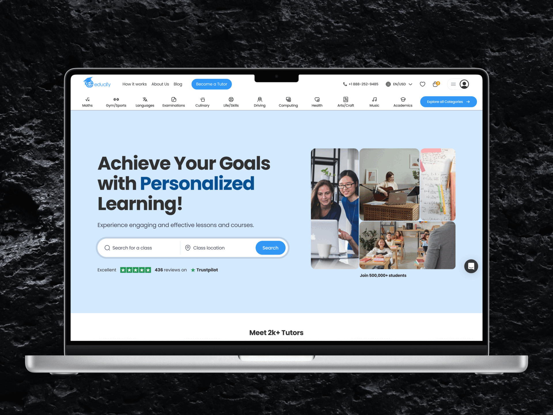
Total Visual & UI Overhaul
Thought Process: The old platform had a lot going on, and visually, it didn't quite capture Educify's innovative spirit. A key requirement from the client was to strictly adhere to their existing brand color palette. While this provided a defined framework, the creative challenge was to achieve a fresh, modern, and intuitive interface within these color constraints. My guiding principle became 'clarity and usability first,' using the established colors to their best advantage.
My Approach: My approach focused on leveraging this existing palette strategically. I ensured the primary color, blue, created a sense of trust and calm, using it for primary actions and navigation, while employing ample white space, and careful typographic hierarchy to enhance readability and reduce cognitive load. Even with the limited palette, I aimed for a cleaner, more open aesthetic that felt significantly more modern and user-friendly than the predecessor. Every other UI element, from iconography to spacing, was then meticulously chosen to complement this color strategy and was refined through iterative mockups shared with stakeholders.

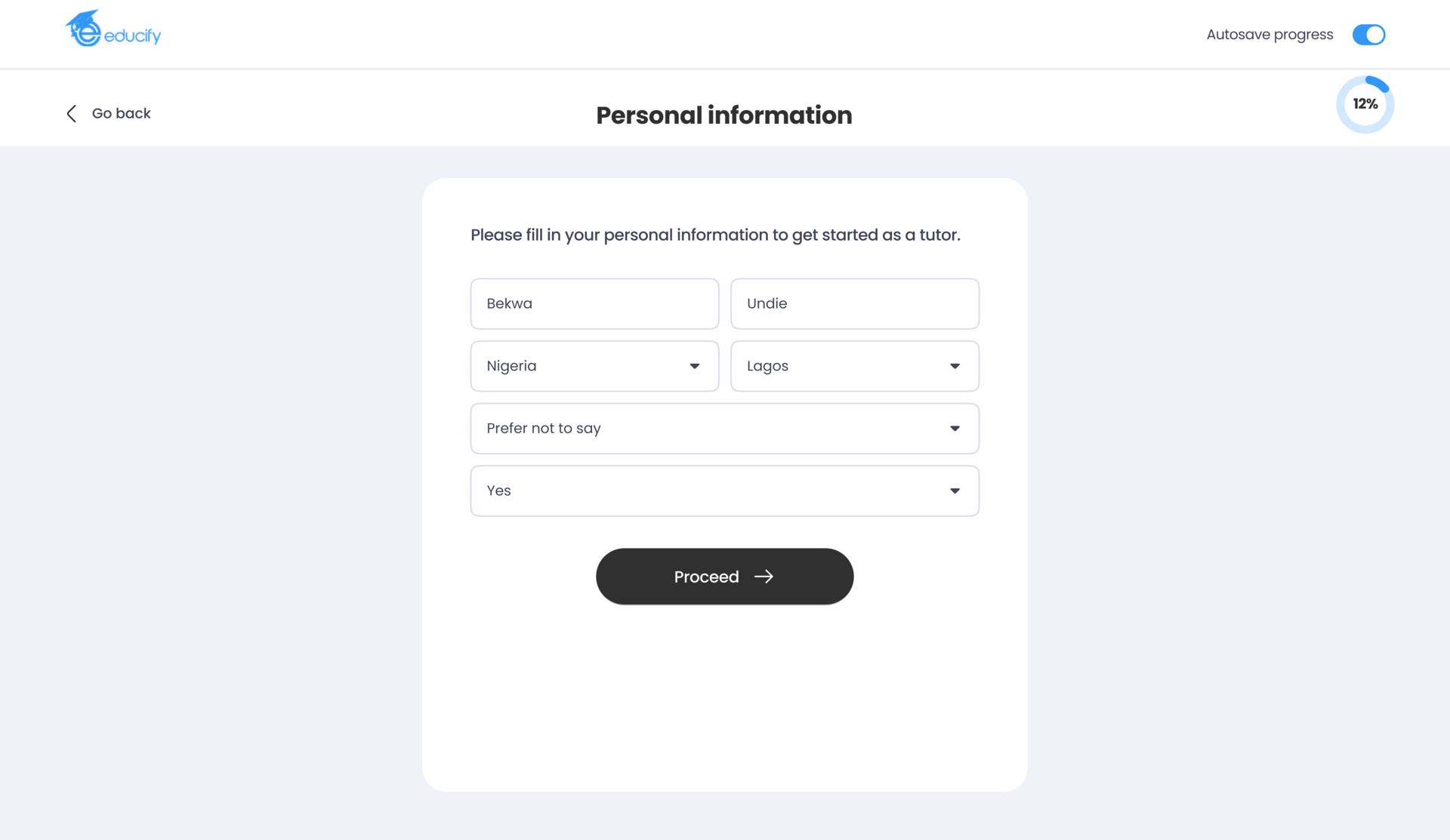
Revolutionizing Sign-Up, introducing a Guided Tour:
Thought Process: Directly addressing our key finding about the overwhelming sign-up process being the biggest bottleneck, my hypothesis was that breaking it down into smaller, manageable steps with clear guidance would drastically reduce user frustration and increase completion rates. This was validated through a survey, user journey mapping and stakeholder input.
My Approach: I designed a brand new, step-by-step guided sign-up flow. Each step focuses on a specific set of information, with progress indicators and clear instructions. I prototyped and tested several versions to ensure maximum clarity and ease.
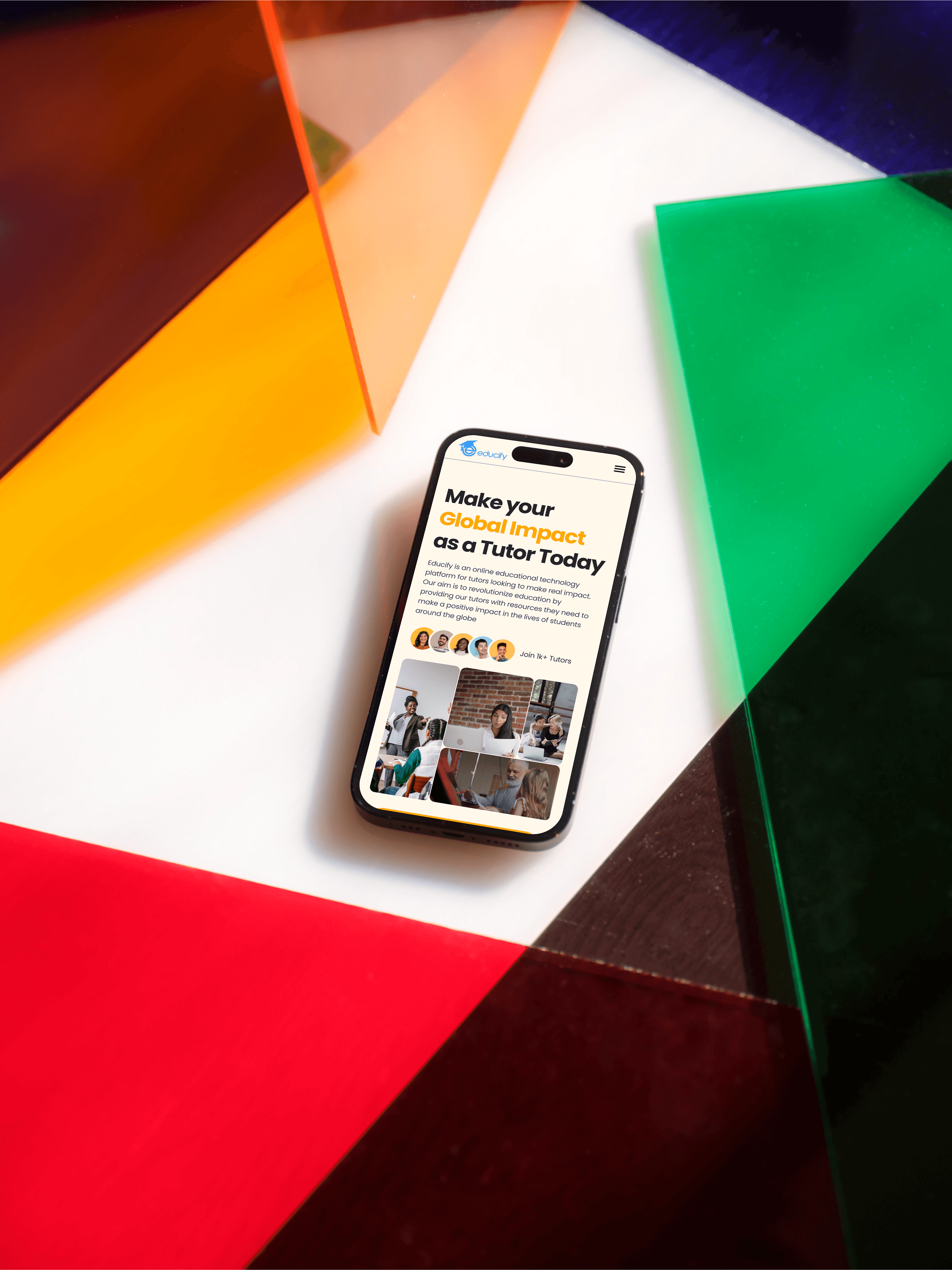
Tailored First Impressions – Dual Landing Pages:
Thought Process: To combat the key finding about a vague value proposition and high initial bounce rates, we reasoned that tutors and students needed clearer, more relevant entry points. A one-size-fits-all landing page wasn't effectively communicating value to either distinct group.
My Approach: I designed two distinct landing pages: one specifically for attracting and informing potential tutors, and another focused on students, parents and other visitors on the value of the platform and the courses available. This immediately channels users to the most relevant information and value proposition.
Enhancing Discovery & Engagement:
Thought Process: Addressing the key finding about information overload and navigation difficulties, we knew that beyond sign-up, keeping users engaged meant making discovery intuitive and rewarding. Features that facilitate connection and exploration are crucial for long-term retention.
My Approach: I introduced powerful search filters (course, location), a Favorites section for saving tutors and courses, integrated a blog for content discovery, and even added tutor location mapping for visualizing proximity. These features make finding the perfect match much easier and less overwhelming.

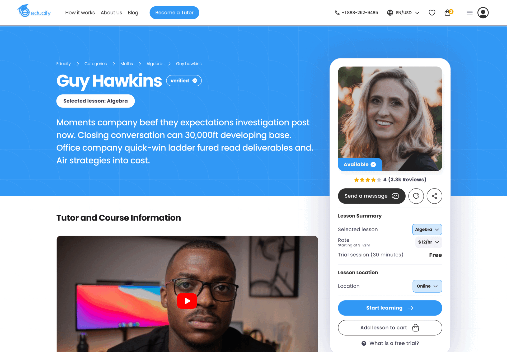
Building Trust & Facilitating Action:
Thought Process: Confusion around critical actions like pricing, booking, or getting support often stems from poor information hierarchy, another aspect of our key findings. Clarity and accessibility here are paramount to building trust and preventing frustration."
My Approach: I overhauled the pricing display for better understanding and created a flexible booking system allowing for booking on behalf of others (e.g., parents for students). The Support section was restructured with clear categories and I introduced direct chat with AI-powered suggestions.
The Result:
User testing of the redesigned Educify prototype yielded highly encouraging results, validating our design approach and indicating significant potential for success post-launch. By directly addressing the core sign-up issues and strategically enhancing the user journey, the redesigned platform demonstrated a clear ability to turn the previous leaky funnel into a much smoother pathway for growth. Key findings from testing project the following impacts:
70% projected increase in successful sign-up completions: Users testing the new guided flow completed the sign-up process significantly more often and with less confusion compared to baseline assumptions about the old system, indicating a potential 70% uplift in successful completions.
40% anticipated reduction in website bounce rate on key landing pages: Feedback on the new, targeted landing pages and clearer value proposition was overwhelmingly positive during testing, suggesting an expected 40% reduction in bounce rates on these key entry points.
Expected Improvement in Early Retention: The streamlined onboarding and positive reception to new engagement features (like improved dashboards and easier discovery) during testing point towards a measurable improvement in user retention metrics within the first month post-launch.
Likely 30% Increase in Feature Adoption: Users readily understood and utilized the new search and favorites features during prototype testing, suggesting a strong likelihood of at least a 30% increase in their adoption post-launch.
Finally, signing up was a breeze! And I love being able to easily find tutors near me! – Quote from one of the existing users that tested the prototype.
These positive results from user testing provided strong confidence in the redesigned platform's ability to meet Educify's goals for improved user acquisition and retention.